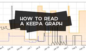
But what if you could decode them? What if these charts became your best friend, showing you exactly where to find profitable products and avoid costly mistakes? That’s what we’re going to do today. We’ll break down every part of a Keepa chart. You’ll learn to see the story the data is telling.
Keepa charts show Amazon product price history, sales rank, and seller data. Reading them helps you understand demand, track competition, and find profitable selling opportunities by analyzing trends over time. Mastering these charts is key to informed Amazon product research.
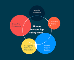
Understanding the Core of Keepa Charts
Keepa is a tool that tracks Amazon product data. It watches prices, sales rank, and seller activity. This happens over days, months, and even years. Think of it as a super-powered historian for every item on Amazon. It records everything important about a product’s life on the platform.
Why is this so helpful? Because past performance often hints at future results. By looking at how a product has done before, you can make smarter guesses about how it will do in the future. This is vital for Amazon sellers. They need to know if a product will sell well and make them money.
The main thing Keepa shows is price history. This is super important. You see the lowest price, the highest price, and the average price. You also see how the price changes over time. This helps you know if a price is good or bad right now.
Another key piece of data is the sales rank. Amazon assigns a sales rank to every product. Products sell more often get a lower sales rank number. So, a rank of 1 is better than a rank of 1000. Keepa tracks this rank over time. You can see if a product’s rank is improving or getting worse.
This tells you about demand. If the sales rank is going down (getting better), it means more people are buying the product. If the rank is going up (getting worse), fewer people are buying it. This is a clear sign. It helps you decide if a product is worth your time and money.
Keepa also shows data about sellers. You can see how many sellers offer the product. You can see if Amazon itself sells the product. This is called the “Buy Box.” The Buy Box is that button on the Amazon page where people click to buy. Having the Buy Box is crucial for sales.
Understanding these basic elements – price, sales rank, and seller data – is the first step. It’s like learning the alphabet before you can read a book. Once you know what each line and number means, the charts start to make sense. They become a powerful tool for finding winning products.
My Own Keepa Chart “Aha!” Moment
I remember one late night, hunched over my laptop. I was looking at a product that seemed like a sure bet. It had good reviews and looked popular. I pulled up the Keepa chart, expecting to see steady sales. What I saw stopped me cold.
The price had been high for months, then suddenly dropped. But the sales rank line was flat, almost dead. It looked like no one was buying it, even at the lower price. It was a stark visual. My initial excitement turned into a knot of worry in my stomach.
This one chart taught me more than pages of articles. It showed me that price isn’t everything. Demand is king. If the sales rank isn’t moving, a low price won’t magically create buyers. It was a valuable, albeit slightly panicked, lesson. I learned to never just glance at a chart.
Quick Chart Breakdown: What’s What?
Price History: The main line showing how much the product cost over time.
Sales Rank: A jumpy line showing how popular the product is (lower is better).
Buy Box Price: The price of the offer that Amazon is currently showing to buyers.
New Offer Count: How many sellers are selling the product new.
Used Offer Count: How many sellers are selling the product used.
Decoding the Lines: A Deep Dive
Let’s break down the specific lines you’ll see on a Keepa chart. Each one tells a part of the product’s story. Understanding them together paints a complete picture. This picture is what helps you make smart selling choices.
The Price History Lines
There are usually a few price lines. The most important is the Buy Box price. This is the price a customer sees on the Amazon page. It’s the price most likely to lead to a sale. Keepa shows this in a specific color, often blue.
You’ll also see the Lowest New price. This shows the cheapest price from any new seller. It’s often lower than the Buy Box price. It can be a good indicator of where the market is heading. You might also see a Lowest Used price line.
The colors of these lines are important. They are usually displayed in a legend. Always check the legend to know which line is which. The key is to see how these prices move together or apart. Do they generally stay close? Or does one jump way ahead of the other?
A steady price can mean stable demand. Wild swings in price might mean a sale, a promotion, or a change in competition. You want to see prices that make sense with sales rank. If the price drops, you’d expect the sales rank to improve (go down).
Price Tracking Tips
- Focus on the Buy Box: This is what customers see.
- Watch for Drops: See if sales rank improves when prices fall.
- Compare New vs. Used: Understand the market for both.
- Look for Patterns: Are prices seasonal? Do they spike before holidays?
The Sales Rank Jumps
The Sales Rank line is often a spiky, jagged line. It shows how often a product is selling. A low sales rank number means it’s selling a lot. A high number means it’s not selling much. This line is usually in a different color, like green.
When a product sells, its sales rank goes down (gets better). When many products sell, the rank can drop dramatically. This causes the spikes. If the line is high and mostly flat, it means sales are slow. If it’s low and showing frequent spikes, it’s a hot item.
Pay close attention to the scale of the Y-axis for sales rank. Sometimes, a product might have a rank in the tens of thousands. Another might be in the millions. A small change for one can be huge for the other. Always consider the overall number.
It’s also good to look at the sales rank over different time periods. Keepa lets you zoom in on a week, a month, or even a year. A product might sell well during a specific season. But it might be dead the rest of the year. Understanding these trends is key.
Sales Rank Insights
High Rank (e.g., 1-50,000): Indicates strong, consistent sales.
Medium Rank (e.g., 50,000-200,000): Moderate sales, may be niche.
Low Rank (e.g., 200,000+): Slow sales, potentially not worth the effort.
Sudden Spikes Down: Often due to sales events, holidays, or promotions.
Understanding Seller and Offer Data
Keepa also tracks how many sellers are offering a product. You’ll see lines for New Offer Count and sometimes Used Offer Count. These lines can show you if competition is increasing or decreasing.
If the number of new offers suddenly jumps, it means more sellers are trying to sell the same item. This can drive prices down. It can also mean more competition for sales. If the number of offers drops, it might mean some sellers are out of stock or leaving the market.
You can also see if Amazon itself is selling the product. This is shown by a specific marker on the chart. If Amazon is in stock, they often win the Buy Box. This makes it harder for third-party sellers. Knowing this helps you assess the risk.
The Buy Box percentage is another crucial metric. Keepa can show you what percentage of the time a specific seller (or Amazon) has held the Buy Box. If a seller or Amazon has it 90% of the time, it’s tough to break in. If it’s split among many sellers, there’s more opportunity.
Competition Indicators
Rising Offer Count: More competition, potential price wars.
Falling Offer Count: Less competition, may indicate strong demand or supply issues.
Amazon in Stock: Significantly harder to get the Buy Box.
Real-World Scenarios: Putting Knowledge to Work
Let’s look at how these charts play out in the real world of Amazon selling. We see different patterns emerge based on product type and market conditions. Understanding these scenarios helps you predict outcomes.
Scenario 1: The Seasonal Star
Imagine you’re looking at a product like holiday decorations. In October and November, you’ll see the sales rank line shoot down (very popular). The price might also be a little higher. As soon as December hits, the sales rank line shoots back up (less popular).
The price might also drop significantly after the holiday. This is normal. This product is a seasonal star. It sells well for a short time. It’s important to know when to buy inventory for this product. You need it before the season starts. You also need to know when to stop selling it.
If you bought too much, you’d be stuck with inventory that won’t sell for another year. If you didn’t buy enough, you’d miss out on peak sales. Keepa clearly shows this seasonal demand. It helps you plan your buying and selling cycles.
Scenario 2: The Price Wars Victim
Consider a generic electronic accessory. The chart might show a steady sales rank for a while. Suddenly, the number of new offers spikes. Several sellers enter the market. What happens next? The Buy Box price starts to drop rapidly. The sales rank line might not change much, or it might worsen slightly.
This is a price war. Sellers are undercutting each other to get sales. The profit margins shrink. Often, many sellers lose money or make very little. This is a product to avoid unless you have a significant cost advantage. Keepa shows this battle clearly. You can see the price plummet and competition rise.
The key here is the disconnect. Sales rank isn’t improving enough to justify the price drop. This signals an unprofitable market. It’s a warning sign. You want to see sales rank improve when prices drop. That shows real demand picking up.
Scenario 3: The Steady Gainer
Now, think about a popular, niche hobby item. The Keepa chart might show a gradually improving sales rank over months. The price might be stable or slowly increasing. The number of new offers stays low or stays consistent. This is a dream scenario.
This product has consistent demand. There isn’t a flood of new sellers. The price is holding steady. This indicates a healthy market. It’s a sign of a product that can provide stable, long-term profits. This is the kind of product you look for. Keepa helps you identify these gems.
It shows you the slow and steady growth. It reveals a market that’s not oversaturated. You can trust these trends more. They suggest a reliable income stream. This is the core of smart product research.
Marketplace Dynamics
- Seasonal: Demand peaks and valleys.
- Price Wars: Competition drives prices down hard.
- Steady Growth: Consistent demand and stable market.
- Trend Chasers: Rapid rise and fall in popularity.
What This Means for Your Selling Strategy
So, how do these chart patterns directly impact what you do as an Amazon seller? It’s about making informed decisions. It’s about choosing the right products and knowing when to act.
When Is It Normal to See Certain Chart Patterns?
Normal: Seeing prices dip slightly before a major holiday, then rise. This is expected. Seeing a sales rank improve (go down) when a product goes on sale is also normal. If a product is new, seeing its sales rank slowly get better over time is good.
It’s normal for the number of offers to fluctuate. Some sellers run out of stock. New sellers might join if the product is doing well. A steady sales rank for a popular item, even with a few sellers, can still be profitable if the volume is high.
Also, consider the niche. Some product categories naturally have more competition. Others have fewer sellers but lower demand. Keepa helps you understand the norms for each category.
When Should You Be Concerned?
Concerning: A product’s price drops sharply, but its sales rank stays the same or gets worse. This means people aren’t buying it, even when it’s cheap. This is a major red flag.
If the number of new offers suddenly explodes, be cautious. It means more sellers are jumping in. This often leads to lower prices and smaller profits. If Amazon itself is consistently in stock and has a high Buy Box percentage, it’s hard to compete.
Also, if a product’s sales rank has been declining (getting worse) for a long time, it might be a dying product. Demand is fading. You don’t want to invest in products that nobody wants anymore.
Simple Checks to Make
Before investing in a product, run these quick checks on its Keepa chart:
- Is the sales rank consistently good (low number)? Look for ranks below 100,000 for most categories.
- Does the sales rank improve when the price drops? This shows real demand.
- Is the number of new offers manageable? Avoid products with hundreds of sellers if you can.
- Is Amazon often in stock? If yes, can you still make a profit after fees?
- Has the product been popular for a while? Or is it a sudden fad that might disappear?
Key Takeaways for Strategy
Buy Box Price: Your main target for price analysis.
Sales Rank Trend: Shows actual customer demand.
Offer Count: Indicates market competition.
Amazon Presence: A factor in Buy Box competition.
Time Frame: Analyze charts over months, not just days.
Quick Tips for Better Chart Reading
Reading Keepa charts gets easier with practice. Here are a few tips to help you improve your skills. These can make a big difference in finding profitable products. They help you avoid common pitfalls.
Adjusting the Time Frame
Don’t just look at the default view. Keepa lets you select different time frames. You can see data for 3 months, 1 year, or even longer. This is super important. A product might look good over a week. But over a year, you might see it has huge seasonal dips.
Always check at least a 3-month and a 1-year view. This gives you a better sense of the product’s true demand cycle. It helps you spot trends that aren’t obvious in short views.
Using the Data Overlay Feature
Keepa has a cool feature that lets you overlay different data sets. You can put sales rank on top of price history. You can see how they interact. This is very useful. It helps you quickly spot correlations.
For example, you can see if sales rank spikes (gets better) when the Buy Box price drops. If it does, that’s a good sign of demand. If the sales rank stays flat even with price drops, it’s a bad sign.
Checking the “Deals” Tab
Keepa has a “Deals” tab. This shows you when a product was part of a promotion or lightning deal. Seeing that a product was heavily discounted and still sold well is a good sign. It means there’s demand for it.
If a product sold very well during a deal, it tells you something. It suggests that price is a key factor for buyers of this item. This can help you gauge how sensitive the market is to price changes.
Quick Reading Tips
- Longer Time Frame: Always check 3-month and 1-year views.
- Overlay Data: See how price and sales rank relate.
- Check Deals: See if promotions drive sales.
- Look for Stability: Stable rank and price are often good.
- Understand Colors: Know what each line represents.
Frequently Asked Questions About Keepa Charts
What is the most important line on a Keepa chart for Amazon sellers?
The Buy Box price line is often considered the most important. This is the price customers actually see and pay on Amazon. It directly impacts your potential sales and profit. However, the sales rank line is equally crucial for understanding demand.
How do I know if a product is profitable by looking at its Keepa chart?
You look for a healthy sales rank trend (improving or consistently low) that matches or follows price drops. You also want to see manageable competition (number of offers). Compare the current Buy Box price to your estimated costs (product, fees, shipping) to determine profit margin.
What does a flat sales rank line on Keepa mean?
A flat sales rank line means the product is not selling much. Even if the price drops, if the rank doesn’t improve, demand is low. This is a warning sign that the product may not be a good investment.
Can Keepa charts predict future sales?
Keepa charts don’t predict the future with certainty. However, they provide historical data. Analyzing past trends, demand, and competition helps you make educated guesses about future performance. Past performance is often a good indicator of future results.
How many sellers are too many on a Keepa chart?
There’s no exact number. It depends on the product and its demand. Generally, if you see hundreds of sellers all with very low prices, it’s a sign of a highly competitive and potentially unprofitable market. For popular items, a few dozen sellers might be fine. For niche items, even 5-10 can be a lot.
What is the difference between Buy Box price and Lowest New price on Keepa?
The Buy Box price is the price of the offer Amazon currently highlights to customers. It’s usually set by an algorithm. The Lowest New price is simply the cheapest price offered by any seller for a new condition item. The Buy Box price is typically higher than the lowest new price, as it represents the featured offer.
Conclusion: Your Chart-Reading Journey Begins
Mastering Keepa charts takes practice, but it’s incredibly rewarding. You’ve learned to look beyond simple price tags. You can now see the demand, competition, and trends that truly matter. This knowledge is your edge in the competitive Amazon marketplace.
Start by looking at charts daily. Compare products you’re interested in. The more you practice, the more intuitive it becomes. Your ability to find profitable products will skyrocket. Happy charting!